11 E-commerce Website Design Best Practices to Boost Conversions and Sales
A well-designed ecommerce website can significantly impact conversions and sales. This guide covers 11 proven design best practices that help shoppers browse easily, trust your store, and complete purchases faster.
Creating a winning e-commerce website design is no small feat. It requires careful consideration of various website design choices, including information architecture, navigation, and individual page layouts. Each decision you make can significantly impact your conversion rate, either positively or negatively.
Since e-commerce businesses typically have razor-thin profit margins, there’s little room for error in website design. This blog post explores some of the best practices used by successful retailers to design high-performing e-commerce websites.
| # | Practice | Why It Boosts Conversions | Implementation Tip |
|---|---|---|---|
| 1 | Hero Products | Grabs attention instantly | Single high-res image or carousel on homepage |
| 2 | Clear Navigation | Reduces bounce rates | Intuitive labels, no jargon |
| 3 | Subcategories | Speeds product discovery | Logical hierarchy for large inventories |
| 4 | Quick Previews | Keeps users on-page | Hover zoom with specs/price |
| 5 | User-Friendly Taxonomy | Minimizes frustration | Clear categories like “Clothing > Sweaters” |
| 6 | Streamlined Checkout | Cuts cart abandonment | Essential fields only; post-purchase upsells |
| 7 | Product Reviews/Ratings | Builds social proof | Stars + detailed feedback near products |
| 8 | Static Info Bars | Avoids pop-up annoyance | Sticky bars for discounts/chat |
| 9 | Prominent Search Bar | Enables quick finds | Top-right, bold/contrasting |
| 10 | Autocomplete Search | Handles typos | Real-time suggestions as users type |
| 11 | Lifestyle Visuals | Sparks desire/upsells | Clickable room setups linking items |
1. Hero Products: Capture Attention Instantly
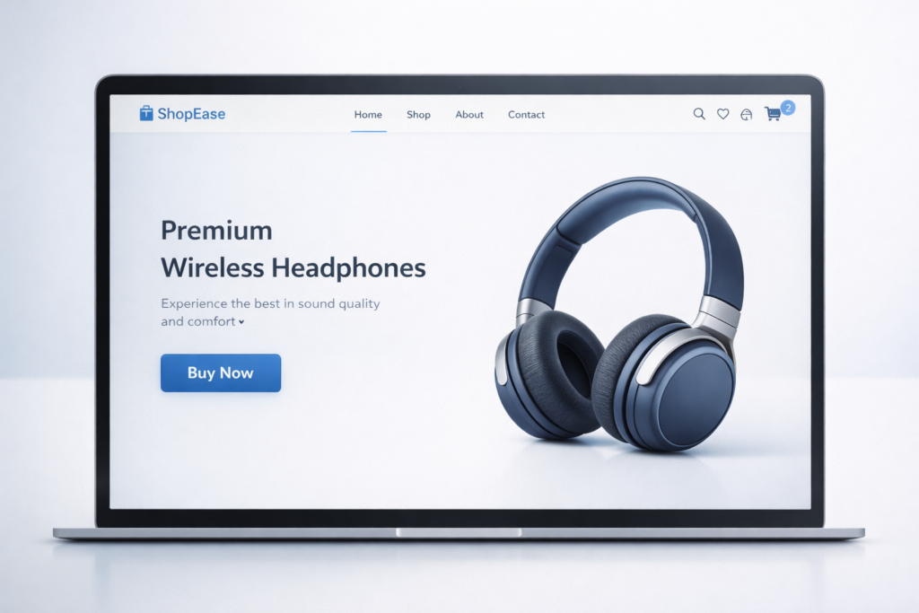
Capture visitors’ attention with stunning hero product images on your e-commerce homepage. Our brains favour visuals, so high-quality product shots quickly communicate your value proposition and create excitement. Use a single hero image for your main product or a carousel showcasing various offerings.
Ensure the images are concise and visually captivating to grab attention and set the tone for your brand. These visuals not only highlight your products but also enhance your website’s appeal, making visitors more likely to explore further. A compelling hero image can significantly boost engagement and conversion rates.
2. Clear Navigation: Guide Users Effortlessly
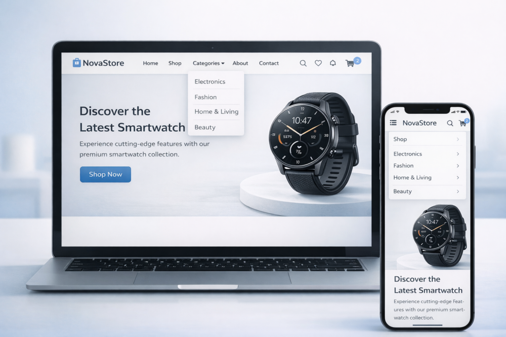
Imagine a customer lost in a physical store, frustrated by confusing department signs. A cluttered navigation bar on your e-commerce website creates the same experience. Clear navigation is crucial. It minimises the effort required for visitors to find products, reducing frustration and keeping them engaged.
When visitors can easily navigate, they’re more likely to buy, directly impacting your bottom line. User-friendly navigation means using labels your target audience understands, ditching technical jargon. This makes browsing a breeze, keeping them clicking “buy” instead of “back.”
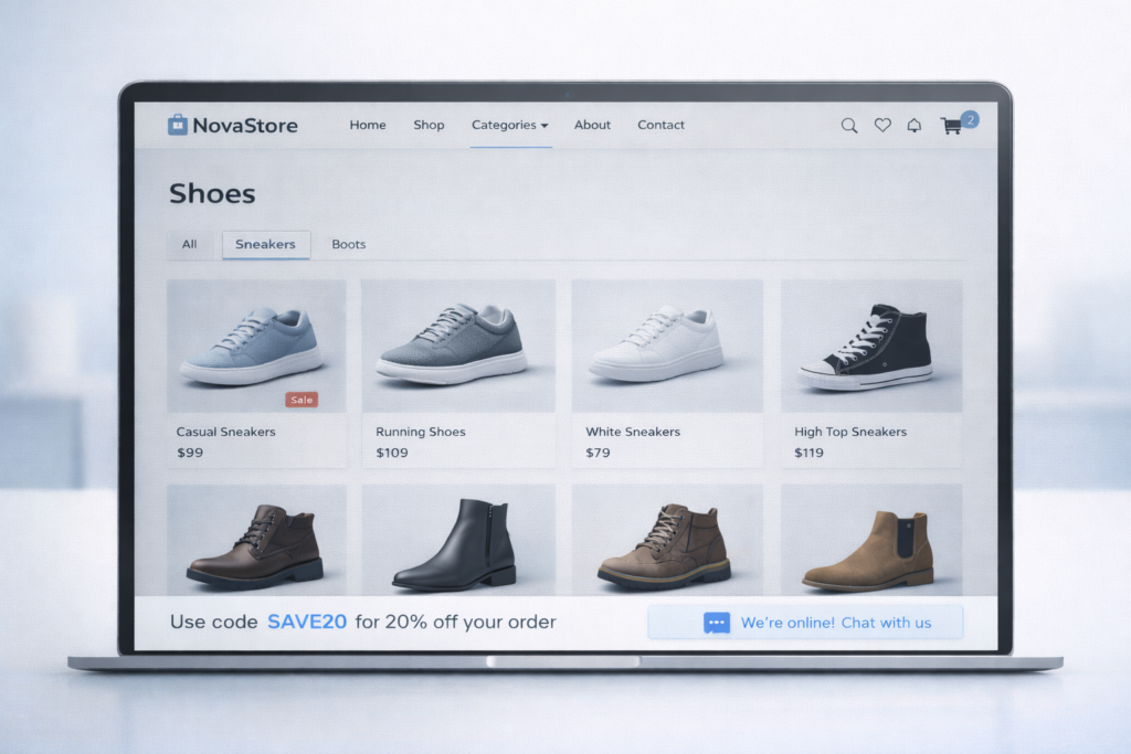
3. Subcategories: Refine the Browsing Experience
Websites with a ton of products? Subcategories are your friend! Think of them like filing cabinets for your online store. They help users narrow down their search based on specific criteria, saving them time and frustration.
Imagine searching for a specific type of shoe – subcategory magic lets them find athletic sneakers or dress boots quickly, instead of wading through every single shoe you offer. This makes browsing smoother and keeps them happy shoppers.
4. Quick Previews: Enhance Visual Merchandising
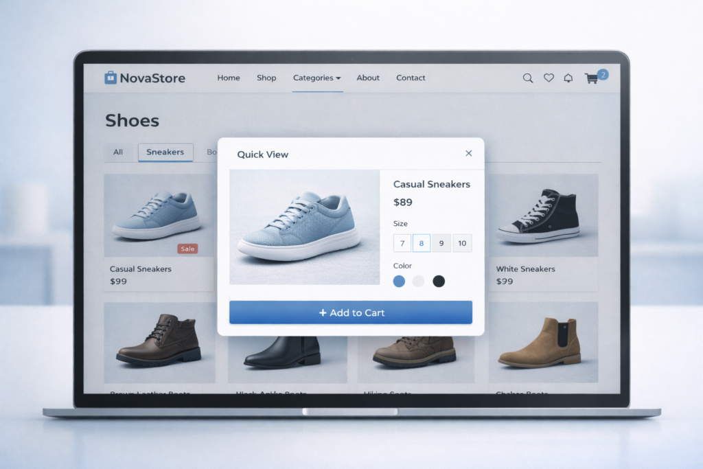
Tired of click-happy shoppers getting frustrated? “Quick Preview” is your secret weapon! Imagine a magic magnifying glass that appears when users hover over a product on your category pages. This nifty feature instantly reveals a zoomed-in image, key details like size and colour, and even the price tag.
No more jumping from page to page – it’s all right there! This keeps browsing smooth, shoppers engaged, and those clicky fingers happy. They can quickly decide if a product piques their interest without leaving the category page, saving them time and frustration. “Quick Preview” is a win-win for a happier, more efficient shopping experience.
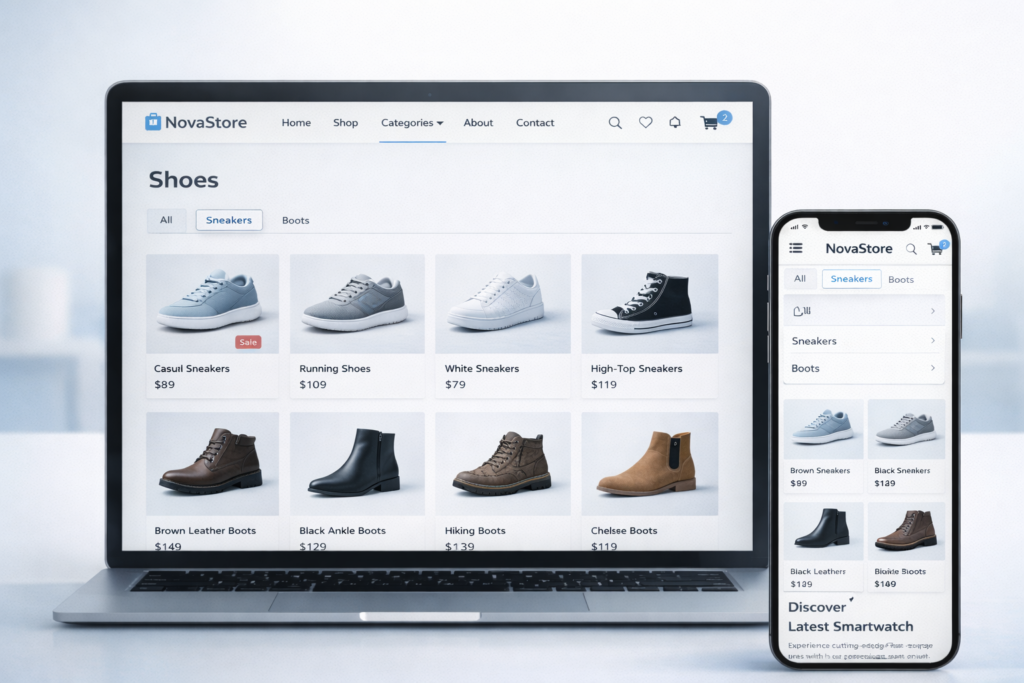
5. User-Friendly Taxonomy: Organise Your Inventory
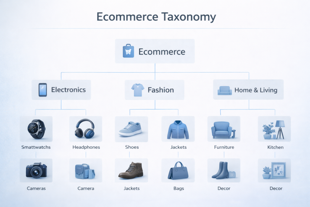
Imagine a giant warehouse overflowing with amazing products, but everything’s piled together! A well-defined website taxonomy is like putting up clear signs and labels. For stores with tons of stuff, this means organising products into clear categories and subcategories.
No more hunting through everything – users can find what they need fast, like comfy sweaters in the “Clothing” section or the latest tech in “Electronics.” This keeps browsing frustration-free and happy shoppers clicking “buy” quicker.
6. Streamlined Checkout: Fewer Form Fields, More Sales
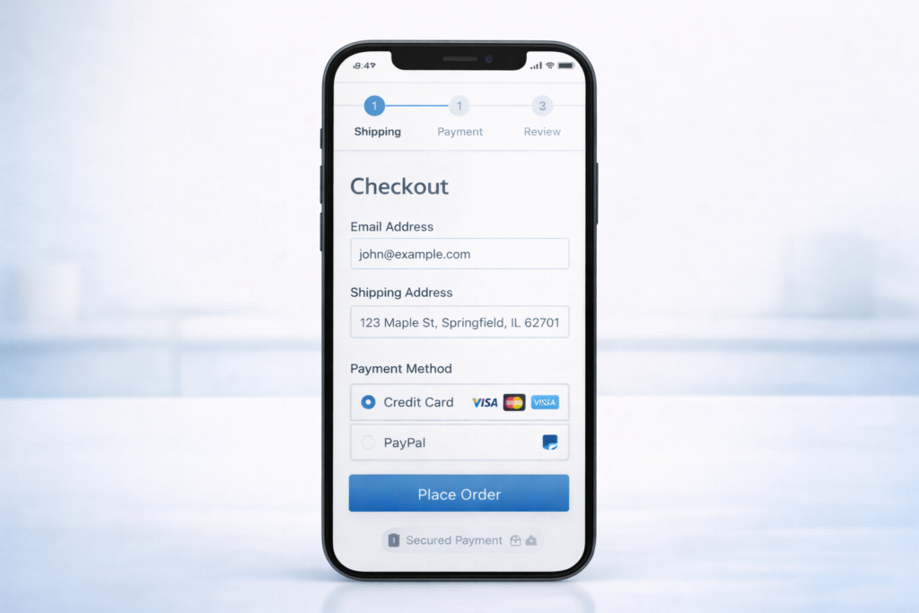
Frustrating checkout experiences are a surefire way to lose customers at the final hurdle. The average completion rate for lengthy checkout forms is surprisingly low. To avoid this pitfall, focus on collecting only essential information for delivery and payment during checkout.
Account creation or loyalty program sign-ups can be offered as a separate step after purchase. By streamlining the process and keeping it quick and easy, you’ll transform those almost-lost sales into happy, returning customers.
7. Leverage Trust: Display Product Reviews and Ratings
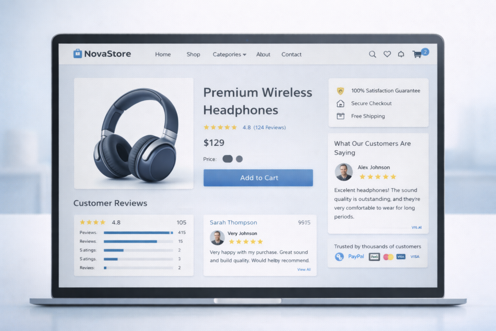
Don’t underestimate the power of word-of-mouth advertising! Many online shoppers rely on product reviews to make informed decisions. Showcase this social proof on your website with a dedicated review section. Include clear star ratings next to each product, alongside space for detailed customer reviews.
Want to encourage even more feedback? Consider prompting users with specific questions or offering templates to guide them. This makes the process easier and helps you gather valuable insights that can boost trust and ultimately, sales!
8. Minimise Disruptions: Static Information Over Pop-Up
Pop-ups are the bane of many online shoppers’ existence. They interrupt browsing, feel intrusive, and can be downright annoying. So, what’s the alternative?
Enter “sticky” UI elements. These are static information bars that stay visible as users scroll down your website. They offer a much smoother way to highlight important information like discount codes, feedback forms, or live chat support.
Think of them like helpful store assistants who are always there when you need them, but never in your face. This way, users have the information readily available without disruption, leading to a more enjoyable browsing experience and potentially more sales.
9. Prioritise Search: Make It Easy to Find Everything
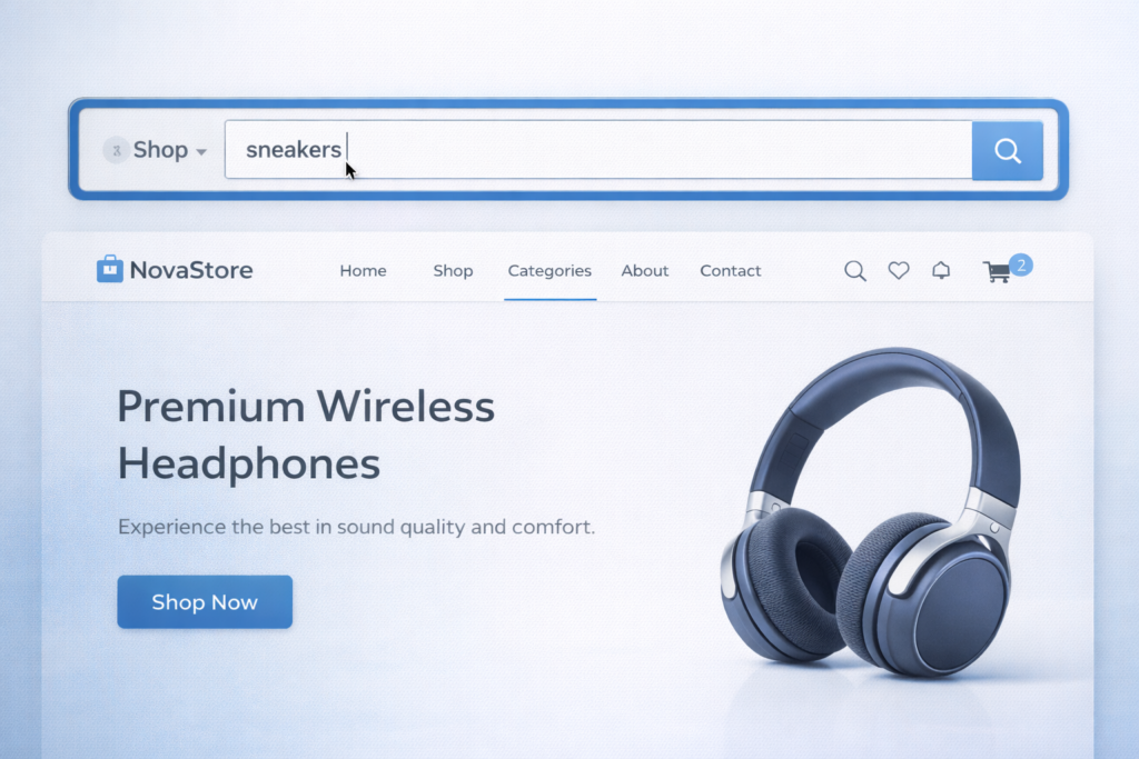
Ever get lost in a physical store, wishing there was a handy search tool to point you in the right direction? The search bar on your e-commerce website is just that!
Since navigation isn’t always perfect, and some users just know what they want fast, make sure your search bar is prominent and easy to find. Think top of the page, with bold borders or contrasting colours to grab attention. This visual cue encourages users to leverage its power, helping them find the specific product they’re looking for in seconds. No more wandering the aisles of your online store – the search bar is their map to shopping success!
10. Enhance Search Accuracy: Autocomplete for the Win
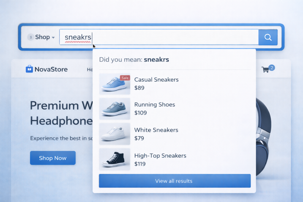
We’ve all been there – typing a product name into a search bar and misspelling it. But a typo shouldn’t stop a customer from finding what they need on your website.
That’s where search auto-complete comes in as a hero! This handy feature suggests relevant products as users type their queries.
Even with a minor typo, auto-complete helps them find the right product quickly and keeps them on the path to a successful purchase. This translates to higher customer satisfaction and, ultimately, more sales for you. So ditch the dead-end searches caused by typos and embrace the power of auto-complete!
11. Bridge the Gap: Inspiration to Purchase
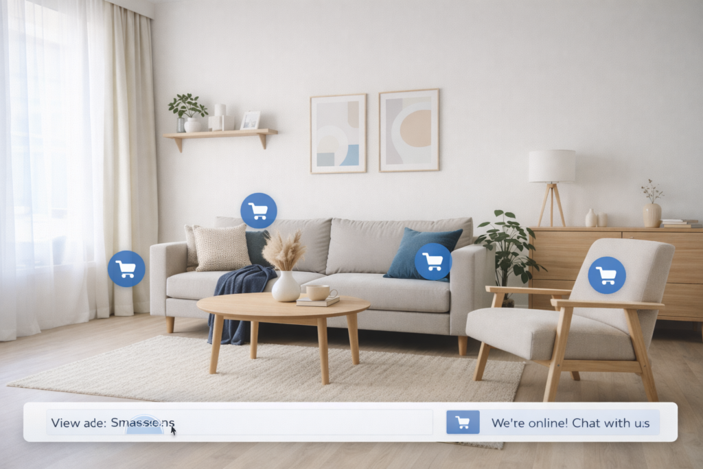
Forget static product shots! Lifestyle visuals are like magic windows, showcasing products in real-life settings. Imagine browsing and seeing a comfy armchair in a stylish living room. But wait, there’s more! Clickable links let you buy the armchair, the throw pillows, even the coffee table – the entire look! This is the power of lifestyle visuals: they help customers visualise the product in their own space, making buying decisions a breeze.
Plus, they act as upsell ninjas! Links to everything in the photo tempt customers to buy the whole “look,” potentially increasing your average order value. Lifestyle visuals can also spark inspiration and create a desire for a complete aesthetic, leading to more sales of complementary items. So ditch the boring photos and watch sales soar as you inspire customers to create their dream look!
Conclusion

In conclusion, crafting a high-performing e-commerce website requires careful consideration of various design elements. By following these eleven best practices, you can create a user-friendly and visually appealing shopping experience that guides visitors effortlessly towards making a purchase.
From captivating hero images and clear navigation to streamlined checkout processes and inspiring product visuals, each element plays a crucial role in driving sales and boosting your bottom line. Remember, a well-designed e-commerce website is not just a storefront; it’s a powerful sales tool that can turn casual visitors into loyal customers.
But, there’s a better way!
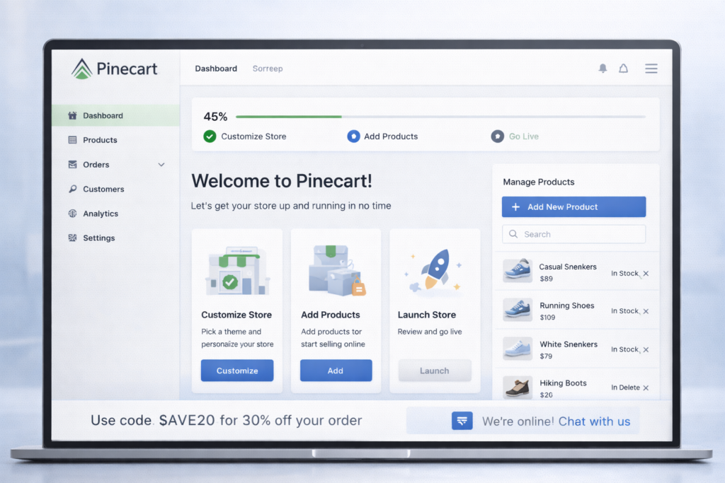
Introducing PineCart, the revolutionary ecommerce platform that gets your dream store up and running in under 30 minutes – yes, you read that right! Forget the days of wrestling with code or hiring expensive designers.
PineCart is designed with YOU in mind, the entrepreneur who wants to focus on what truly matters – creating amazing products and connecting with customers. Forget complex platforms. Our user-friendly design lets you customise your brand, manage products with ease, and focus on selling. Get a free trial – ditch the hassle, start selling fast!
FAQs
Question: How does hero product imagery boost conversions?
Answer: High-res visuals grab attention instantly, communicate value, and lift engagement 30-50%.
Question: Why prioritise streamlined checkout?
Answer: Fewer fields cut abandonment (avg 70%); essential info only, post-purchase upsells.
Question: What is a quick preview in e-commerce UX?
Answer: Hover zoom showing specs/price keeps users on category pages, reduces friction.
Question: Mobile-first e-commerce best practices?
Answer: Responsive design, touch-friendly nav, fast load times-60%+ traffic is mobile.